
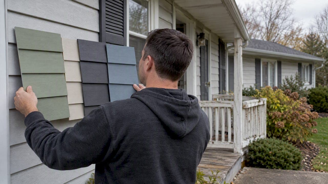
Muted greens, warm neutrals like LP Sand Dunes, deep charcoals, saturated blues, and selective sunny yellows define siding color trends for 2026. Sage and olive fit traditional homes. Warm neutrals suit farmhouse and craftsman builds. Charcoal and matte black work on modern designs. Navy and slate add contrast on cottages. Yellow stays an accent, not a main color. Named shades are product-specific. Always confirm availability and warranty terms with the manufacturer before you order.
TL;DR:
- Neutral and nature-inspired greens, such as sage and olive, dominate for 2026 and suit a variety of architectural styles from farmhouse to modern ranch.
- Dark colors like matte black and charcoal remain popular for modern builds but require careful installation and maintenance to prevent fading and visible wear.
- Color perception varies depending on siding material, with fiber cement and engineered wood carrying a slightly darker, more saturated appearance than vinyl, and testing on actual substrates is recommended.
- Using high-contrast accents like doors or shutters in bold colors enhances curb appeal, especially on neutral siding, which is optimal for resale value.
- Climate and regional norms influence color choices, favoring lighter neutrals in snow-heavy areas and greens or warm neutrals in milder or coastal regions.
Table of Contents
- 1. Leading siding color families for 2026
- 2. Two-tone and tonal layering palettes that actually work
- 3. How substrate and finish change the way color reads
- 4. A step-by-step process for choosing and testing your siding color
- 5. Installer-tested guidance and proof points from AM Exteriors
- 6. How siding color affects resale value
- 7. Regional and climate factors that shape color choice
- 8. Eco-friendly and sustainable paint options for siding colors
- 9. Durability and maintenance expectations for 2026's trending colors
- 10. Our viewpoint: balancing 2026 trends with long-term curb appeal
- Sources
- FAQ
1. Leading siding color families for 2026
Each family below fits a different architectural style and comes with its own pairing logic for trim, roofing, and resale.
Sage, olive, moss, and deep forest green lead the pack this year. Trend coverage links nature-inspired greens to landscaping compatibility and broad style range, from farmhouse to modern ranch. These greens pair well with white or black trim and asphalt roofs in charcoal or weathered wood tones.
Warm neutrals hold steady as the safest long-term choice. LP SmartSide named Sand Dunes its 2026 color of the year, positioning it as a versatile neutral built for its ExpertFinish siding systems. Greige and taupe sit in the same family and suit craftsman, colonial, and transitional homes. These tones pair with almost any trim color and tend to hold resale appeal across buyer tastes.
Charcoal and matte black continue to dominate modern builds. Valspar's tint data shows black stains remaining popular for exterior wood elements, including decks and pergolas that complement dark siding. On a full house, dark colors read best with white or natural wood trim to avoid a flat facade.
Saturated blues, including navy and slate, give cottages and bungalows a confident look without feeling trendy for trend's sake. The same Valspar release notes blues and greens as rising categories alongside neutrals.
Sunny yellow is the surprise mover. Valspar's 2026 data shows a notable rise in yellow tint requests, though the shade works best as a door or shutter accent rather than a whole-house commitment in most climates.
Benjamin Moore's exterior lineup includes Revere Pewter HC-172, New Hope Gray 213-50, and Simply White OC-117, all of which read as warm neutrals or crisp whites and overlap with the greige and warm-neutral trend.
A quick scan of where each family fits:
- Sage, olive, moss: farmhouse, ranch, modern cottage; pair with black or white trim.
- Warm neutrals (Sand Dunes, greige, taupe): craftsman, colonial, transitional; pair with almost any trim shade.
- Charcoal, matte black: modern, contemporary; pair with white trim and natural wood accents.
- Navy, slate blue: cottage, bungalow, coastal-inspired builds; pair with white or cream trim.
- Sunny yellow: accent only, doors and shutters; pair with white or gray siding.
Color names vary by manufacturer even when the undertone is nearly identical. A greige from one brand may lean warmer or cooler than a similarly named shade from another, so treat the name as a starting point, not a guarantee.
2. Two-tone and tonal layering palettes that actually work
Tonal layering uses two shades from the same color family, which keeps a house looking coordinated rather than busy. High contrast pairs opposite values, like charcoal siding with white trim, for a sharper, more dramatic look. Both approaches work. The choice depends on how bold the homeowner wants the exterior to read from the street.
Eight recipes worth testing:
- Sage body, cream trim, black shutters: soft contrast that suits farmhouse and cottage styles.
- Olive body, white trim, natural wood door: earthy and traditional.
- Sand Dunes body, white trim, navy door: warm neutral with a crisp pop of color.
- Greige body, charcoal roof, black window frames: modern and low-maintenance.
- Charcoal body, white trim, red door: dramatic dark paired with one bold accent.
- Slate blue body, white trim, black shutters: coastal feel with classic contrast.
- Taupe body, cream trim, yellow door: warm neutral with a sunny accent.
- Deep forest body, white trim, matte black roof: bold green anchored by neutral trim.
Save tonal layering for the whole house when the look is close in value. Reserve high contrast for smaller elements such as a door, shutters, or a gable accent so the eye has a single focal point. Texture and sheen also help preserve hierarchy: a matte body with a satin trim reads cleaner than two glossy finishes competing for attention.
3. How substrate and finish change the way color reads
Vinyl, fiber cement, and engineered wood each reflect light differently, which means the same color name can look different depending on what it's applied to.
- Fiber cement and engineered wood siding, including LP SmartSide, typically carry a matte or low-sheen finish that reads slightly darker and more saturated than the same color on smooth vinyl.
- Vinyl siding has a glossier surface by default, which can wash out deep colors and make them look lighter in direct sun.
- Dark colors on heat-absorbing materials can expand and contract more over seasonal temperature swings, so it's worth confirming manufacturer testing before committing to a full charcoal or black exterior.
- Benjamin Moore notes that vinyl siding can be repainted, but only with vinyl-appropriate paint systems and proper surface preparation.
Pro Tip: Order a physical sample board in the exact substrate you're installing, not just a paint chip, since texture changes how a color reads outdoors.
Readers weighing substrate options can review how LP SmartSide, James Hardie, and vinyl siding compare before locking in a color choice.

4. A step-by-step process for choosing and testing your siding color
Picking a color off a screen is the fastest way to end up disappointed once the siding goes up. A short, deliberate process avoids most regrets.
- Assess your home's architectural style and existing fixed elements like roofing and stonework.
- Narrow the field to three to five candidate hues based on style fit.
- Request physical samples or factory sample boards rather than relying on digital swatches.
- Install test patches on at least two elevations, including one that gets full afternoon sun.
- Check the patches in morning, midday, and afternoon light before deciding.
- Compare the leading candidates against your roof, stonework, and landscaping.
- Confirm availability and warranty terms directly with the manufacturer before ordering.
Favor resale-friendly neutrals when you plan to sell within a few years. Lean into a bolder choice, like deep green or navy, when you're staying long term and want personal style over broad appeal.
| Situation | What to do |
|---|---|
| Color looks too flat in person | Add trim or shutter contrast |
| Sample looks different in shade vs. sun | Test on multiple elevations before deciding |
| Considering a dark color in a hot climate | Verify manufacturer heat and warranty testing |
| Repainting vinyl siding | Use vinyl-rated paint and confirm surface prep |
5. Installer-tested guidance and proof points from AM Exteriors
Color choice only matters if the installation holds up. AM Exteriors has operated as an owner-supervised exterior contractor for more than 25 years and partners directly with LP SmartSide and other manufacturers on siding projects. Dark colors show wear and fading faster at seams and trim lines when flashing and trim work is done poorly, since gaps and misaligned panels become more visible against a saturated color. Whether a home needs a repaint or a full replacement often comes down to how the existing material has held up, not just how tired the color looks.
Most siding and roofing failures come down to workmanship, not the material itself.
For more on substrate choice, see the comparison of LP SmartSide, premium vinyl, and James Hardie and the breakdown of board and batten siding design.
6. How siding color affects resale value
Buyers respond to color before they walk through the front door, and real estate coverage consistently points to neutral and nature-inspired tones as the safer bet for resale. Industry trend coverage identifies green families as a strong 2026 pick partly because they photograph well against landscaping and suit a wide range of architectural styles, which matters when a home is listed online first.
Warm neutrals carry the broadest appeal because they read as updated without being polarizing. A sage or olive green follows close behind since it reads as intentional rather than trendy. Dramatic darks and saturated blues can work well in the right neighborhood and architectural context, but they narrow the buyer pool more than a neutral would.
The safest approach for anyone planning to sell within the next few years is a neutral main body color with one trend-forward accent, like a yellow door or navy shutters. That keeps curb appeal current without betting the whole exterior on a shade that might look dated by the next listing cycle. Homeowners who plan to stay long term have more room to commit to a bolder full palette, since they'll get the daily enjoyment of the look rather than hoping the next buyer agrees with it.
7. Regional and climate factors that shape color choice
Climate affects both how a color performs and which shades make sense visually. Darker colors absorb more heat, which matters more in regions with long, intense summers than in places with shorter, cooler seasons. Homes in snow-heavy climates often lean toward lighter neutrals and grays that show less dirt buildup from road salt and slush, while homes in milder, greener climates can lean into sage and olive tones that echo the surrounding landscape.
Humidity and moisture exposure also play a role in material choice, which in turn affects color. Fiber cement and engineered wood siding tend to hold color more evenly in damp climates than some vinyl products, since matte finishes diffuse light differently than glossy ones. Coastal regions often favor blues and slate tones that fit the setting, while wooded or rural regions tend to favor greens and warm neutrals that blend with the environment rather than standing apart from it.
Local building style matters too. A deep charcoal that looks sharp on a modern build in one region might look out of place on a traditional colonial elsewhere. Matching color to both climate performance and regional architectural norms tends to produce better long-term results than chasing a national trend in isolation.

8. Eco-friendly and sustainable paint options for siding colors
Low-VOC and zero-VOC paint lines have become standard options across most major exterior paint brands, giving homeowners a way to repaint or refresh siding without the strong fumes and off-gassing associated with older formulas. These formulas work across the same color range as conventional paints, so choosing a sustainable option doesn't limit access to the trending greens, neutrals, or darks covered earlier in this guide.
Reflective and heat-resistant exterior coatings are also worth a look for homeowners in hotter climates who want a dark color without the full heat-absorption tradeoff. These formulas are designed to reduce surface temperature compared to standard dark paints, which can help with both comfort and long-term color retention.
For siding materials like LP SmartSide and fiber cement, factory-applied finishes already reduce the need for repainting over the product's lifespan, which cuts down on the ongoing paint and solvent use that comes with a traditionally painted exterior. Checking a product's factory finish warranty is a practical way to weigh durability against the environmental footprint of future touch-ups.
9. Durability and maintenance expectations for 2026's trending colors
Warm neutrals and lighter grays tend to show the least fading and the least visible dirt over time, which keeps maintenance simple. Greens fall in a similar range, especially muted tones like sage and olive, since they don't rely on a stark white or deep black to make their statement.
Charcoal and matte black require more attention. These colors show fading, chalking, and surface dust more visibly than lighter tones, and they can expand and contract more with temperature swings depending on the substrate. Confirming a manufacturer's heat and fade testing matters more for these shades than for any other family on this list.
Saturated blues sit in the middle. They hold up reasonably well but can show fading on the sun-facing elevation faster than the shaded sides of a house, which sometimes creates a visible mismatch over several years.
Sunny yellow, used mostly as an accent, holds up fine in smaller doses like a door or shutters, but isn't widely tested as a full-body siding color, which is part of why most guidance treats it as an accent rather than a main palette choice.
10. Our viewpoint: balancing 2026 trends with long-term curb appeal
Pick one trendy element, a door or an accent color, and keep the main siding in a neutral that will still look intentional in ten years, unless the whole look is a commitment you're ready to make. Trends shift faster than siding gets replaced. An owner-supervised installation, clear documentation, and a confirmed manufacturer warranty protect the investment regardless of which palette wins this year.
— Heather
Sources
- LP SmartSide — Sand Dunes color-of-the-year
- Benjamin Moore — Vinyl siding color ideas and painting guidance
- Valspar press release via PR Newswire — 2026 exterior color trends
- Homes
FAQ
What is the common color for siding houses in 2026?
Warm neutrals like greige, taupe, and LP SmartSide's Sand Dunes lead the pack alongside muted greens such as sage and olive. Both families work across a wide range of architectural styles, which is part of why they show up so often in 2026 color guidance.
What's the most popular exterior house color for 2026?
Nature-inspired greens and warm neutrals are the most consistently recommended exterior colors for 2026, according to trend coverage from Homes.com. Dramatic darks like charcoal and matte black remain popular for modern builds, though they suit a narrower range of styles.
What are the trendy exterior colors for 2026?
The leading families are muted greens, warm neutrals, charcoal and matte black, saturated blues, and sunny yellow used as an accent. Valspar's 2026 tint data points to a notable rise in yellow requests alongside steady demand for neutrals and black stains.
What is the most popular siding color right now?
Warm neutral tones remain the most widely chosen siding color, with greige, taupe, and shades like Sand Dunes topping manufacturer recommendations. These colors pair easily with most trim and roof combinations, which keeps them a reliable choice for homeowners weighing resale value.
Should I choose a trendy color or a resale-friendly one?
Choose a resale-friendly neutral for the main siding if you expect to sell within a few years, and save a bolder trend for a door or accent. Homeowners planning to stay long term have more flexibility to commit to a full bold palette like deep green or navy.